This app is another page for you to see all your feeds on one screen, except this one’s a looker!
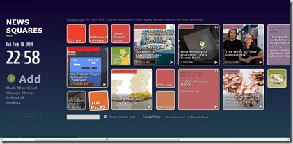
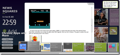
Going into the app brings you into a world of RSS feeds, arranged in a grid of squares, some big, some small. NewsSquares will add a couple stock feeds, and as a bonus, add all the feeds present in your Google Reader account automatically. When you click on a square, you can read posts from the feed, right in the app. You also have the choice of changing the size; small square just show the name, while large squares show a picture related to the most recent post.
NewsSquares is meant only for RSS feeds; Facebook, Twitter, and other are not allowed. This is a shame, since it really would’ve made this the killer app.
On the appearance of the app, it looks pleasing, with the grid of squares on one side, and a clock with the date on the other. There are only two backgrounds to choose from, however. It would’ve been nice to set our own picture in the background, but maybe that’s for another update. Another hindrance is the frame rate of NewsSquares. Now I could be wrong, maybe I just have a slow computer, but when I click on a feed, scroll through the squares, or pull up options, I experience a slow, laggy fade into whatever I was doing. This may seem like a small problem, but the slow frame rate is very inconsistent with the rest of this app, making it seem clunky.
One more thing I noticed: There’s a button right beneath the clock that says “Reserved Space for a Coming Awesome Feature!” Maybe this could be social network integration.
Overall, this is a clean, nice app for people with multiple RSS feeds in their Reader account, or for people that just want to glance at their updates. A fine addition to anyone’s collection is this app!
Download NewsSquares here.


No comments:
Post a Comment